Freelance web design often operates in a zone of extreme friction. Clients want a highly bespoke visual identity. Budgets strictly dictate the exact opposite. One week to deliver a fully fleshed-out portfolio site isn't much time. Hiring an illustrator to handcraft a dozen brand assets? Completely off the table.
That tension forces a difficult choice. Dig through generic stock websites hoping to find loosely matching images, or spend hours drawing rudimentary shapes yourself. Neither option feels particularly professional. Faking a custom look from pre-made assets is entirely possible.
Stop treating illustration libraries as a place to find isolated graphics. Treat them as modular design systems instead.
The Empty State Dilemma
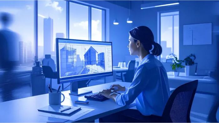
Late Thursday evening hits hard. Staring at a blank Figma canvas, I'm trying to assemble a visual identity for a regional logistics company. My client requested a modern look for their new portal. They need custom artwork for the login screen, an empty dashboard state, a successful delivery confirmation, and a 404 error page. Budget allocated for original art equals exactly zero dollars.
Pulling a generic delivery truck photo for the login page and a cartoon box for the empty state ruins everything. Visual language shifts from screen to screen break the user experience immediately. Users notice disjointed visuals instantly. Trust evaporates when a professional portal suddenly looks like a patchwork quilt of random search engine results.
Search strategies need to change. Open Ouch. Filtering down its 101 distinct illustration styles-ranging from colorful surrealism to simple monochrome line graphics-turns up a minimal, brutalist aesthetic. Layered vectors break down into tagged, searchable objects rather than flat scenes. Grabbing a warehouse scene for the login page takes minutes. Add a sparse pallet graphic for the empty state and a broken gear for the 404 screen.
Every piece shares exact line weights, perspectives, and shadow treatments. Suddenly, that client gets a unified UX flow looking intentionally commissioned.
Pushing the Customization Limits
Matching styles only gets you halfway there. Small business clients usually have established brand colors. Dropping a pre-made blue graphic into a strictly green and gold palette instantly breaks the illusion.
Mega Creator changes the game. Building a landing page for a boutique coffee roaster required complete alteration of pre-made graphics. Supply chain visuals needed to shine. Searching the library turned up a great agricultural set. Unfortunately, default colors glowed neon purple and teal.
Pushing those graphics into the online editor solved the problem. Recolor every individual vector path to match earth-toned hex codes like burnt sienna and deep espresso brown. Swap out generic backgrounds for specific leaf shapes found elsewhere in the system. Rearrange layouts to fit horizontal website headers perfectly. Adjusting scale and composition takes mere seconds.
Final exports feel completely proprietary.
That level of manipulation answers a central stock art question. A vector illustration library absolutely supports a coherent brand system. Platforms just need to give you tools to surgically alter base files.
Elevating Portfolios With Motion
Static sites struggle to command premium pricing. Adding motion fixes that fast.
Dynamic pricing pages do wonders for local fitness instructors launching online subscription services. Custom animation usually requires specialized software and hours of timeline manipulation. Sidestep that headache by exploring native animated formats instead.
Filter the library for 3D sports graphics. Grab a character performing a warmup routine. Skip the flat PNG download and export the file as a Lottie JSON. Drop that code directly into your website builder. Webflow and Framer handle these files beautifully.
Engaging movement keeps potential buyers on the page longer. Characters animate smoothly as users scroll down pricing tiers. Rive files and After Effects projects exist for users who edit animation curves themselves. Supplying clients with lightweight, interactive 3D elements fundamentally changes how they view the final product. It makes cheap budgets look wildly expensive.
Evaluating the Landscape of Pre-Made Assets
Navigating current illustration tools requires understanding distinct architectural differences.
Take unDraw as an example. Rapid wireframing works beautifully here. Quick color adjustments take seconds. Ubiquity remains its biggest drawback. Artwork so widely used instantly signals a low-budget approach. Your client looks exactly like thousands of tech startups launched over the last five years.
Humaaans provides incredible flexibility for mixing diverse character traits. Swap hairstyles, clothing, and poses effortlessly. Scope limitations hit hard, though. Everything focuses exclusively on people. Need abstract technology metaphors, web elements, or business icons? Source them elsewhere and instantly break visual consistency.
Dedicated in-house illustrators remain the absolute gold standard. Nothing beats sitting down with an artist to craft a visual language existing nowhere else. That approach just fails to align with tight two-week freelance contracts.
Ouch occupies a highly practical middle ground. Boasting over 28,000 business illustrations and 23,000 technology assets, sheer volume prevents roadblocks. Finding specific metaphors within a single style family happens fast.
Where the Stock Illusion Breaks Down
Flawless pre-made libraries don't exist. Common user flows like checkouts, error pages, and standard marketing materials work brilliantly. Highly specialized industries fracture the system.
Build a site for an industrial manufacturer needing a specific hydraulic press calibration process. You won't find it. Forced reliance on generic factory graphics often frustrates specialized clients. They know their industry better than any stock artist. Missing technical nuances stand out immediately.
Pricing models dictate workflow too. Free tiers provide PNG files but require an Icons8 attribution link. Placing links on a professional client portfolio looks amateurish. Serious client work demands upgrading to a paid plan. SVG formats, high-resolution files, and zero attribution requirements unlock immediately.
Maximizing Pre-Made Assets
Maximize an illustration library through strict discipline. Follow these core rules:
- Memorize exact illustration style names and refuse mixing them.
- Install Pichon desktop app to drag transparent graphics directly into design software without breaking focus.
- Always download SVG formats to manipulate individual anchor points and remove unnecessary background clutter.
- Take advantage of paid plan rollover downloads to stockpile assets during slow freelance months.
Fully custom illustrations aren't always necessary for distinct brands. Deep libraries covering entire user experiences work just fine. They just need to endure heavy modification.
Post Comment
Share your thoughts about this article.
Be the first to post a comment!