
A layout grid is not a rule, it is a choice. Modern UI frameworks ship with strong grid tools, and native CSS gives you real two-axis control. The hard part is knowing when a grid will make the page easier to read, and when it will slow you down. Teams now design for tiny watches and very wide screens, often with the same code base, so structure has to help users scan and choose without adding noise.
In real products, the best layouts use a grid when the page asks people to compare like with like, and they skip it when the page is a story that flows top to bottom. The aim here is to give you a clear lens for that choice. We will start with a concrete example that shows why a tidy grid works so well for fast decisions, then look at current support and performance data, and finish with guidance you can apply on the next sprint.
A clean grid for fast choices
Open the lobby for Ignition blackjack (Image 1) and you see a calm grid of game tiles. Each tile follows the same frame. Image at the top, title in a fixed position, key rules or table type set in a consistent spot, and a clear call to action that sits on the same baseline from tile to tile. That sameness is not boring, it is helpful. The eye can jump across the row, compare options, and make a choice with very little thought. The gaming section of Ignition blackjack online shows how a grid does the heavy lifting of choice by keeping structure steady and letting content change.
Look closely at how the grid shapes the scan. Equal card sizes keep edges clean, which keeps gutters readable. Uniform padding creates rhythm, so you can read diagonal lines across tiles without losing your place. Shared aspect ratios stop images from pulling the row out of alignment. Even small details help. Labels use the same size and color across tiles, and microcopy lands in the same corner each time, so your eye knows where to find it. This is how a grid reduces the mental work of comparing many similar choices
From the user’s perspective it’s very easy to navigate through different variants of the blackjack game, as everything is put out on a clean interface, from American blackjack to European.
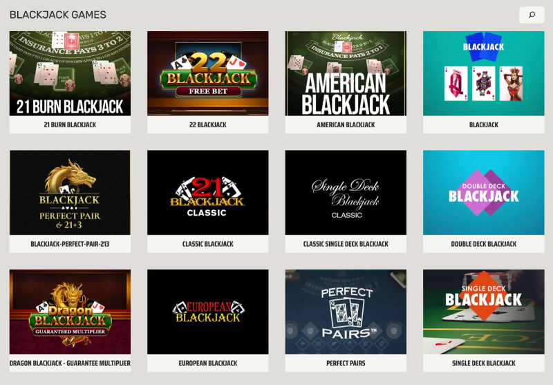
The grid also helps on smaller screens. As the view gets narrow, the tiles stack, but their inner order stays the same. Image, title, details, action button appear in a familiar sequence, which preserves trust. People can switch from a laptop to a phone and still read the layout in one glance. That continuity makes the overall experience feel simple and quick.
There is a strong ops benefit too. When every tile follows one frame, the team can add or swap variants without layout drift. New tables slot into the same tracks, so you do not need one-off CSS fixes. If you later add filters above the grid or a quick view on hover, you already have clear anchors to place them. The result is a lobby that stays neat over time, loads fast, and lets users get to the table they want with fewer steps. This is the core lesson the lobby teaches. If you present many similar items and want low friction decisions, a firm, even grid is your friend.
When a framework grid helps, and when to skip it
Native CSS Grid is widely supported, which makes it a safe base for two-axis layouts. Can I Use reports about 95.99 percent global support for Grid, so you can rely on it across modern browsers with few fallbacks. Flex layouts remain a great choice for one-axis flows, and MDN notes that flex has been broadly available across browsers since 2015. It is worth pairing these facts with basic hygiene. The 2024 Web Almanac found only 62 percent of homepages had minified CSS, which means many sites still carry extra weight. Keep your CSS lean so the grid you choose does not slow the page.
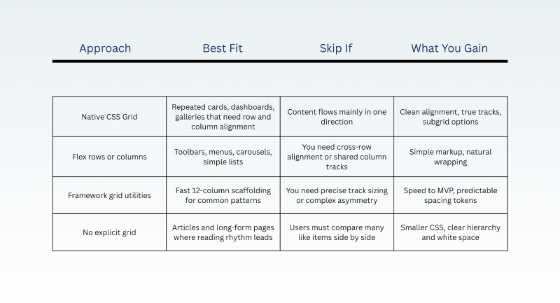
Support and performance trends point the same way. Use Grid when alignment in both directions clarifies the task, and keep flex for one-axis stacks. Then trim unused rules and minify styles so the layout work pays off in perceived speed. On mobile, performance still lags desktop. In 2024, 74 percent of mobile sites had good Interaction to Next Paint, while desktop hit 97 percent, so every saved byte helps.
The cases for skipping the grid
A grid is a decision tool. If your page is a story, not a catalog, strong typographic rhythm and spacing can do more than strict columns. The W3C puts it plainly: “Grid Layout is optimized for 2-dimensional layouts, those in which alignment of content is desired in both dimensions.” If your content does not need that, pick a lighter pattern.
There is also the cost of change. Marketing sections and hero blocks shift often. Freeform compositions with large images and short copy may fight a strict track system, which can turn small text edits into layout chores. In those cases, keep the flow simple, set a clear vertical rhythm, and reserve grids for the parts that repeat, like comparison blocks or card rails. Your CSS stays smaller and your mental model stays clear.
It helps that the core tools are mature. Grid’s global support sits near 96 percent, so you can adopt it where it adds real value without worrying about most users. Flex is still the right call for single lines of content, and it has been stable across major browsers for years, which makes it a safe default for navigation bars and controls. Pair this with simple performance habits. Minify CSS and avoid dead rules. The Web Almanac’s 62 percent figure for minified CSS is a reminder that basic hygiene still moves the needle.
Post Comment
Be the first to post comment!