Whether you code emails, design them, or use them to drive serious revenue, mobile responsive email templates should already be part of your email DNA.
After all, mobile has become the go-to medium for 71.5% of consumers who use their phones to scroll through emails.
Naturally, if they receive messages that feel forcibly squeezed into a small screen—with no regard for readability—they won’t hesitate to delete them in under three seconds.
This undeniably increased use of mobile, now infused into your customers’ daily routines, calls into question the email design philosophy your marketing stands on.
In the words of Megan Boshuyzen, an email developer, the mobile experience should inform your email design system. Which means that optimizing email viewability and usability on mobile devices is just as important as thinking about how they render on desktops.
Plus, it’s not just about an easy and intuitive email experience for your subscribers. Emails optimized for mobile layouts can deliver up to 15% more unique clicks.
But planning email templates for smartphone users comes with a caveat: that how a mobile responsive email layout renders isn’t solely in your hands. It depends on a range of variables.
Understanding those factors is essential. Not only to guide informed design decisions, but also to improve how you think about mobile-first design as a whole.
Let’s unpack what really determines how your mobile responsive email layout displays.

What Is a Mobile Responsive Email Design?
A mobile responsive email template is a design that automatically adjusts itself to the size and orientation of the reader's device. The layout shifts, resizes, and reorganizes content. So whether someone’s reading on a phone, tablet, or laptop, your email stays clean, readable, and easy to use.
Unlike responsive email layouts, static or unresponsive designs don’t budge. They’re locked into fixed layouts and widths. This doesn’t let them adapt to different device screen sizes. Which often causes display issues and poor readability on smaller screens.
There’s one term that keeps getting tossed around like it means the same thing as responsive design: mobile-friendly.
But here’s the thing—mobile-friendly email design isn’t the same as responsive. Mobile-friendly emails are often just trimmed-down versions—narrower layouts, bigger buttons, shorter copy. They fit the smaller screen and that’s it. They don’t adapt to different screen sizes.
Whereas, mobile responsive email layouts are dynamic. They actively shift and reflow content blocks. Rearrange columns into single stacks. And resize elements to enhance readability and usability. All this according to the screen they are being read on.
This distinction matters because mobile responsiveness is about behavior, not just appearance. It’s not enough for your email to look good when shrunk to a mobile screen. It needs to function intuitively, too.
Meaning that buttons must stay tappable, text should be legible, and images must load and scale appropriately, across a fragmented email client and mobile device ecosystem.
What Factors Influence How a Mobile Responsive Email Design Renders?
Short answer: more than you probably imagine.
A variety of technical and contextual factors determine how a mobile responsive email design renders on each recipient’s device.
Here’s a quick breakdown of what shapes the end-user experience:
Email Clients
For the unversed, an email client is the software or app you use to read, send, and organize your emails. It is the interface between you and your inbox.
Every email client —from Gmail to Outlook—uses its own rendering engine to translate your HTML and CSS into visual design.
But unlike web browsers, these engines interpret HTML and CSS differently. Some follow web standards closely (like Apple Mail). And some (like Outlook) use outdated engines like Microsoft Word to render content.
The inconsistency leaves you with significant variation in how the same email displays across devices and inboxes.
Translation: A mobile-responsive email layout might render flawlessly in one inbox but may appear unrecognizably broken in another.
Email Client Rendering Comparison
Here is exactly how the major clients differ, so you can plan fallbacks instead of discovering breakage after sending:
| Client | Rendering engine | Media queries | Dark mode behavior | Key quirks to plan for |
| Apple Mail (iOS/macOS) | WebKit (browser grade) | Full support | Partial auto-invert; respects prefers-color-scheme | Best-in-class support; auto-detects phone numbers and dates as blue links |
| Gmail (app and web) | Proprietary sanitizer on Blink | Supported in embedded styles | Full forced color inversion, no opt-out | Clips messages over 102KB; strips the entire style block on a single CSS syntax error |
| Outlook (classic Windows desktop) | Microsoft Word | Not supported | Forced inversion in some versions | No background images without VML; adds gaps around images; needs MSO conditional code |
| New Outlook / Outlook.com | Edge WebView (web based) | Supported | Partial inversion | Much closer to web standards than classic Outlook; behavior differs from desktop Word engine |
| Yahoo Mail | Web based | Supported | Partial inversion | Generally reliable; occasional issues with attribute selectors |
| Samsung Mail | WebKit based | Supported | Aggressive auto dark mode | Default client on many Android devices; test dark mode here specifically |
Device Screen Size and Resolution
There are hundreds of devices with unique screen sizes. From a 4.7-inch iPhone SE to a 6.8-inch Samsung Galaxy Ultra, screen sizes are all over the map. And that’s just the phones.
Now add in laptops, desktops, tablets, and phablets and there is a wild mix of dimensions to deal with. With hundreds of different screen sizes available, your responsive email has a tall order of rendering perfect across them.
CSS and HTML Support
If you're accustomed to designing sleek, CSS-driven web pages, remember this: email HTML hasn’t moved on since the early 2000s.
Rendering behavior also depends on which HTML and CSS properties the email client supports. Many email clients strip out scripts, forms, or even embedded CSS.
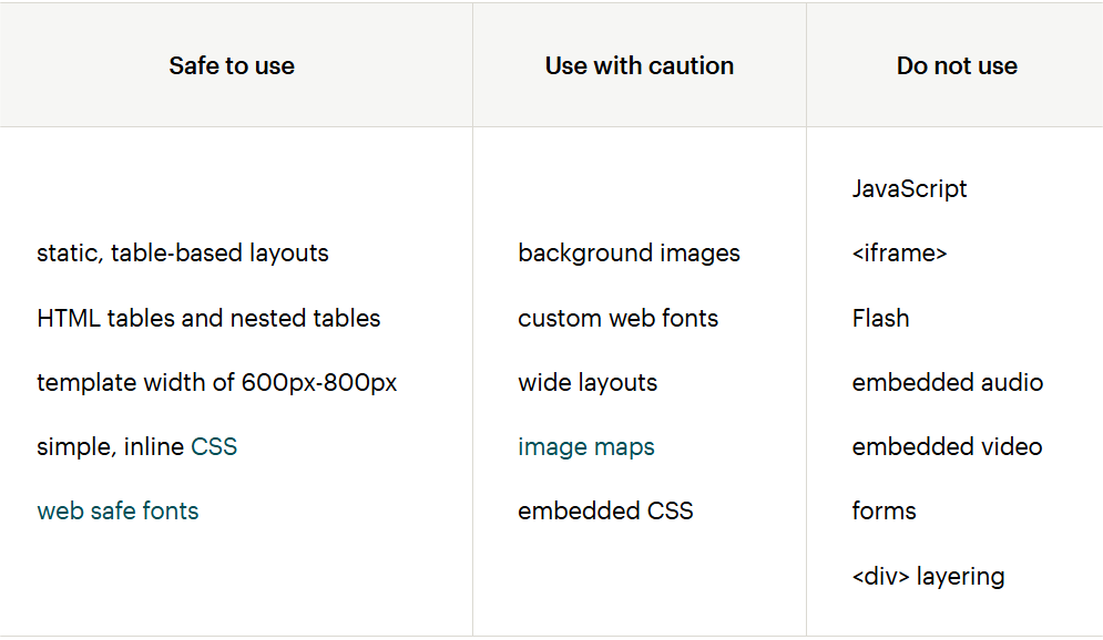
Inline CSS and table-based HTML are still the most reliably supported options across clients. More complex or web-like elements tend to be broken.
That’s why knowing what’s safe to use and what’s a rendering disaster waiting to happen is non-negotiable while creating mobile responsive email designs.
Use this table as your cheat sheet:
Email Service Provider (ESP)
Platforms like Klaviyo, Mailchimp, or HubSpot are known to rewrite email code on send. They’ll toss in tracking pixels, rewrite links, and sometimes strip out perfectly good styling in the name of “deliverability.”
Sometimes helpful. Often harmful. Often.
However, it’s why you should always test inside the ESP from which you’re sending. Not just in your dev tool or browser preview.
Image and Font Handling
Many email clients often block images by default, especially on first open. And still, many choose not to support custom fonts at all.
Fonts like Arial and Verdana? They are web-safe, as most email clients universally support them. However, the moment you experiment with custom web fonts, support becomes wobbly. Apple Mail’s usually fine with them, but Outlook? Not so much.
User Settings (Dark Mode, Zoom, Accessibility)
Quite many marketers make this mistake of ignoring user-controlled settings which heavily influence rendering. So don’t be that marketer.
Dark mode can invert colors or clash with image overlays, making designs hard to read. Zoomed-in views may distort layouts that weren’t built with fluid widths. Screen readers and accessibility features may also interpret content in unintended ways unless semantic HTML and alt text are correctly implemented.
With the release of iOS 13 and beyond, Apple’s system-wide dark mode automatically impacts Mail, making proper color contrast and fallback states essential.
Code Structure and Fallbacks
Finally, how your code is structured has a foundational contribution. Responsive email designs use media queries that adjust layout for different screen widths.
But not all clients honor these. Gmail, for instance, only supports media queries under very specific conditions.
That’s when fallbacks help you create a safety net over which your email design can fall gracefully should a media query fail.
Troubleshooting: Common Rendering Problems and Fixes
| Symptom | Likely cause | Fix |
| Columns do not stack on mobile in Gmail | Media queries broken by a CSS syntax error, or styles were inlined-only | Validate the style block; one error kills all of it in Gmail. Keep media queries in an embedded head style block. |
| Email cut off with 'View entire message' in Gmail | HTML exceeds roughly 102KB | Minify HTML, remove unused CSS and comments, shorten tracking-heavy links, split very long emails. |
| Layout explodes in Outlook desktop | Word engine ignoring divs, max-width, or floats | Rebuild the skeleton with tables and add MSO conditional ghost tables with fixed pixel widths. |
| Unwanted gaps under images in Outlook | Images rendered as inline elements with baseline spacing | Add style="display:block" to every img tag. |
| Thin colored lines or 1px gaps in Outlook | Word engine rounding at certain DPI settings | Match background colors of adjacent cells; avoid designs that depend on pixel-perfect seams. |
| Logo invisible in dark mode | Dark logo on background that the client inverted to dark | Use a transparent PNG with a white outline, or swap via the dark mode CSS class shown above. |
| Fonts look different from the design | Custom web font unsupported and falling back to a serif default | Declare a full fallback stack: font-family:'Brand Font', Arial, Helvetica, sans-serif. |
| Random blue links on iPhone | Apple Mail auto-detecting phone numbers, dates, addresses | Wrap detected text in an anchor with color and text-decoration explicitly set to match body text. |
| Buttons too small to tap on mobile | Text link or thin CSS button | Use the bulletproof button pattern above with at least 44x44px total tap area. |
| Email looks fine in preview, broken after sending | ESP rewrote or stripped code on send | Always send real tests from inside the ESP to seed accounts on Gmail, Outlook, and Apple Mail. |
Wrapping Up
At this point, “mobile responsive” isn’t the latest email design trend. It’s a bare essential.
Your audience isn’t blocking a separate time to check email on a big screen. They’re opening it in checkout lines, on the train, during lunch.
That means your emails don’t get a second chance—they need to work, instantly, on whatever device they land on.
Mobile responsive email design bridges that gap.
However, the trade-off is that responsive email templates introduce more edge cases, additional test environments, and increased complexity.
The good news is that you can bring in outside help to scale your responsive email design without compromising on quality and performance. The specialized expertise of good partners, like Email Mavens, helps you create emails with the same expertise they use across multiple industries.
And even if you have the time and skill to do that in-house, it’s best to concentrate on things only you know about your business that no other partner can replace.
Post Comment
Share your thoughts about this article.
Be the first to post a comment!